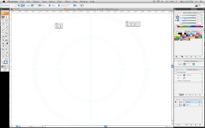
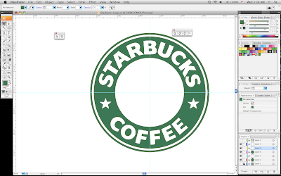
Next, I used the pen tool to draw out all of the letter forms.
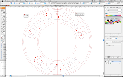
The following step was to create the stars. I used the star tool to create the general forms of the star. Then, I modified the points to get the form down correctly. After that, I copied the first star I created and replicated it to be used for the second star.
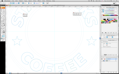
The longest and hardest step was creating the image in the center. Again, I used the star tool to create the star on top of her crown using the points to modify it. For the rest of it, I used the pen tool to trace the individual lines and curves.
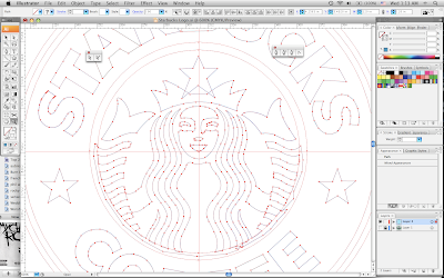
The next step was color. I separated the image in the middle and the circle behind it into separate layers. Then, I colored the circle black and the image white.
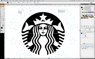
After that, I matched the color of the logo to fill in the color in the circles and the font. I put each circle on a different layer so they would lay correctly once they were filled in with color.
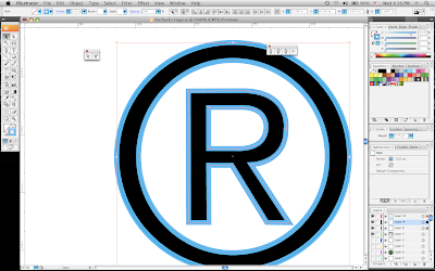
I used the same principles as above to create the copyright for the logo. I used the ellipse tool for the circles and the pen tool to outline the letter.
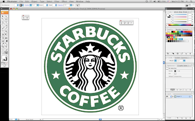
And finally, you have the finished product...the Starbucks logo.
No comments:
Post a Comment