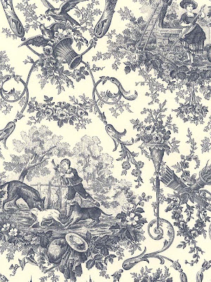
Here is my final heraldry piece. All of the elements were either drawn in illustrator using the pen tool or were drawn by hand then traced in illustrator using the pen tool. With the roses below, I actually tried to scan in my drawing then use the live trace feature to create the lines. Unfortunately, it didn't work out so well and created a mess of lines some of which appeared to be very jagged from the rendering. So instead of fixing every single part that live trace messed up, I instead opted to just trace it by hand with the pen tool. It definitely came out quite a bit better.
Next thing I did was create the shield. I did it by drawing half of it with the pen tool then duplicating and reflecting the opposite side. After that I just moved the pieces together and it came out with a symmetrical shield.
Same thing as with the shield, I drew half of the crown then replicated it to create the opposite side. With that technique it seemed to be quite a bit easier to make a symmetrical drawing as opposed to drawing the whole thing out at once.
After that, I used the pen tool to draw the banner in illustrator. Same as before I drew half then copied it for the opposite side. Then I arranged the roses, shield and banner into place.
Following that, I moved the crown into place and added color to it. I also added my last name to the banner. With everything now in place, you have the final product...my heraldry shield.
Monday, June 8, 2009
Stop Motion Entertainment - The Letter F
For my stop motion animation, I got the letter "F." For my idea, I decided to animate it using a bunch of squares, or cut up pieces of tape to be exact, broadcast onto lights. My idea was to somewhat replicate the lines that music engineering boards or stereos have in order to show the volume of what is playing. Unfortunately, I had to do it without sound though. So in the end, I used a stationary camera to photograph the lights and moved around the pieces of tape in a patterned form. Here is the result. Enjoy.
Wednesday, May 27, 2009
Heraldry Research
For my heraldry research, I mainly wanted to check out what my family crest looked like. Being of Irish decent, it is common for families to have a crest. Although each crest I found differs from one another in small ways, they all tend to have similar elements. They all have the knights helmet, the crescent moon, the focal point of the lion stepping on or smashing the serpent, the Irish clovers, and of course the traditional ivy running up the sides of the shield.
Wednesday, May 20, 2009
Cryptozoology Beast
Here are some pictures from my process that occurred during the creation of my animal. I used a number of different tools to make the image. To cut each piece out, I mainly used the alpha channels but also used the magnetic lasso tool on occasion. To combine all the pieces, I used the healing brush, dodge, burn, and transformation tools to skew, shade, and match all the pieces into one uniform image.
Here are a couple of examples of how I used both the magnetic lasso tool and alpha channels to extract pieces of each image.
And here is the final product.
Here are a couple of examples of how I used both the magnetic lasso tool and alpha channels to extract pieces of each image.
And here is the final product.
Wednesday, April 29, 2009
Starbucks Logo Process
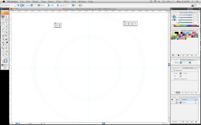
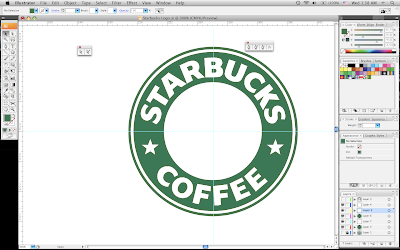
The first thing I did was to create the different layers of circles within the logo using the ellipse tool.
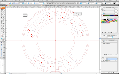
Next, I used the pen tool to draw out all of the letter forms.
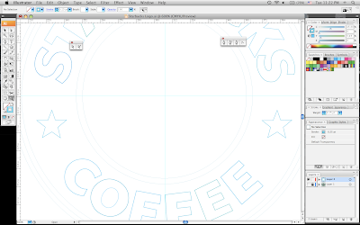
The following step was to create the stars. I used the star tool to create the general forms of the star. Then, I modified the points to get the form down correctly. After that, I copied the first star I created and replicated it to be used for the second star.
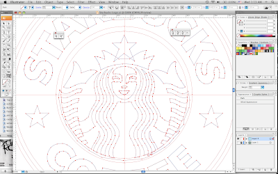
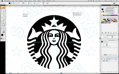
The longest and hardest step was creating the image in the center. Again, I used the star tool to create the star on top of her crown using the points to modify it. For the rest of it, I used the pen tool to trace the individual lines and curves.
The next step was color. I separated the image in the middle and the circle behind it into separate layers. Then, I colored the circle black and the image white.
After that, I matched the color of the logo to fill in the color in the circles and the font. I put each circle on a different layer so they would lay correctly once they were filled in with color.
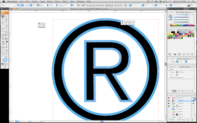
I used the same principles as above to create the copyright for the logo. I used the ellipse tool for the circles and the pen tool to outline the letter.
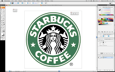
And finally, you have the finished product...the Starbucks logo.
Monday, April 27, 2009
Starbucks Logo History
Over the years, the Starbucks logo has taken many forms. Although it always contained the image of the siren from Greek mythology, the look and feel has changed dramatically. Developed in 1971, the original logo featured the image of a siren inspired by a historical Norse woodcut. The image of the siren was used to symbolize the irresistible nature of the coffee. The logo initially was also created with a band to look similar to a cigar label. The siren in their logo since it's conception has always had twin tails. In the original version of the logo, the sirens tails were fully visible and she was also shown topless. The color was dramatically different as well having the entire logo colored in a shade of brown. In the second version of the logo, her hair covered her breasts but her two tails were still visible. As the company grew, the nature of the logo had to be more censored for commercial usage. In the current version, they updated the color to green. The sirens hair covers a good portion of her body now and only a portioned view of her two tails remain.
Original Logo:
Current Logo:
Original Logo:
Current Logo:
Monday, April 20, 2009
Wednesday, April 15, 2009
Bradbury Thompson Biography
Bradbury Thompson was a designer on the forefront of the industry. Throughout his career, he influenced and advanced the field of design. From his usage of typography to his implementation of photographic imagery, he combined type and picture in a way none had done before. Descending from the printing industry, he took his knowledge of type and moved it in a new direction in design. He not only used type to portray written words but also to create dynamic images in his pieces. He also created the infamous "Alphabet 26," which is known as a simplified typeface combining both lower and uppercase forms to create one unified form of type. In many of his designs, he'd combine his use of image based type along with photographs that were commonly printed in the process colors. This was a trademark look for his pieces many of which appeared in his designs for the "Westvaco Inspirations" publication. He also spent ten years of his career creating the Washburn College Bible. In 1986, the Type Directors Club of New York gave him an award noting that it was one the best reproductions of the Bible since the Gutenberg Bible. Throughout his career he also received many awards and honors notably The National Society of Art Directors of the Year award in 1950, the AIGA Gold Medal award in 1975, and was also an inductee in the Art Directors Hall of Fame in 1977.
Wednesday, April 1, 2009
Wallpaper Project
Subscribe to:
Posts (Atom)